Details
Every design has its details. This is an example!
1. Theme & having fun
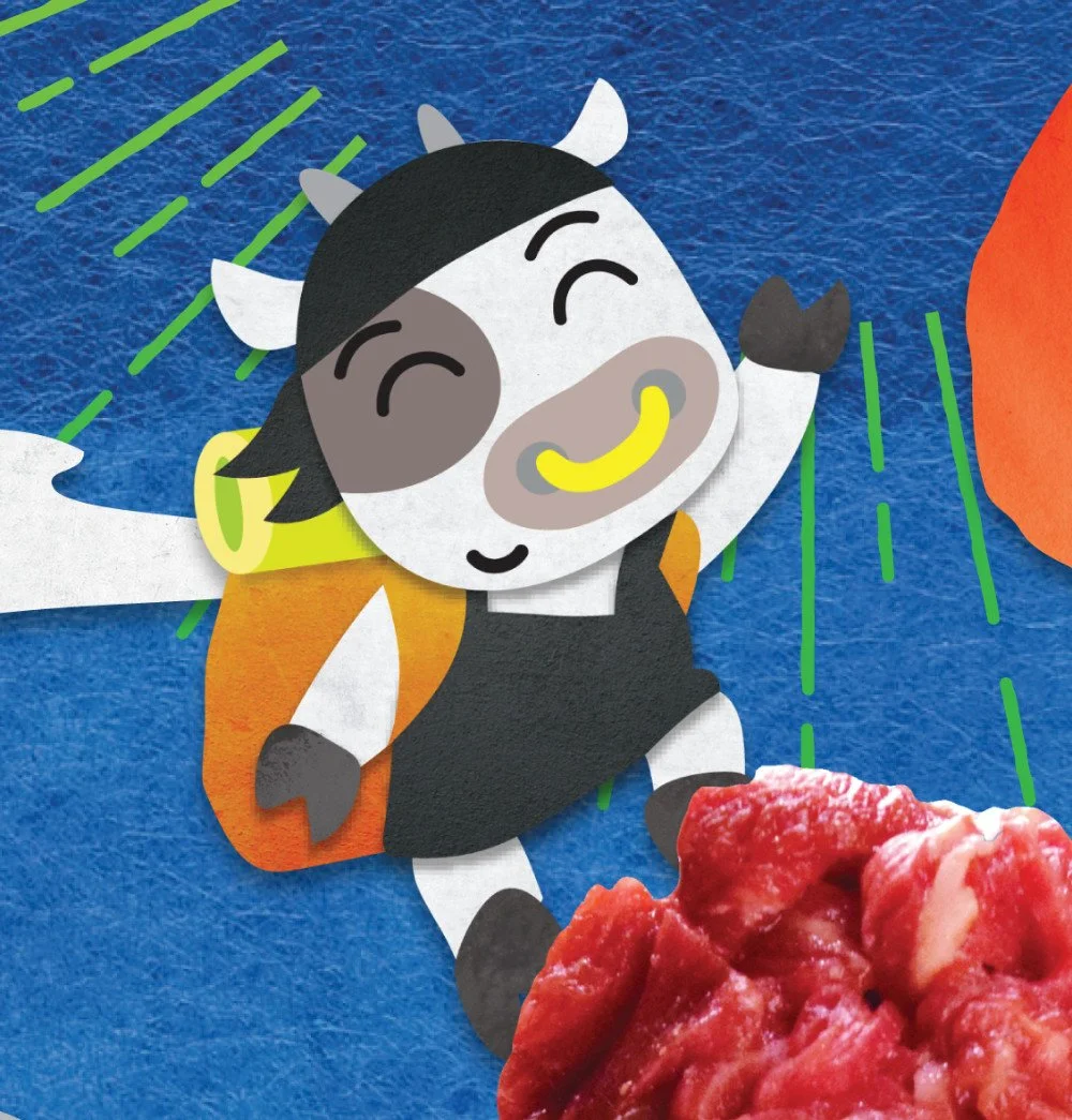
This promotion is annual, so I needed to find a new look. For this one, it was “paper texture.” The cow character is a mascot for this restaurant, so, of course, he was created with paper texture. Most of the paper used are Japanese washi paper.
2. Story of “Adventure”


Pepole see UFOs in distance on the cover. And once they opened the menu, someone was abducted. I put this idea on design draft, and luckily, decision makers liked it. (They even encouraged me to make it obvious. Yay!)
3. Information

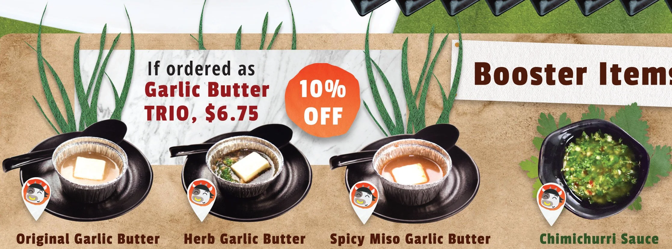
Important information could have fun, too. Promotional details are on the road sign since Usshi, the cow character, is having an adventure and traveling around.
Let’s put garlic leaves for garlic sauces, and chimichurri leaf for chimichurri sauce. That way, guests could imagine a little even if they don’t know what garlic or chimichurri are.
4. Little touches
Do we really need these lines to make sales up? I am not sure. However, these details could be sublime.
When my designer team saw the menu, one of them pointed out and aid “I like this detail on yellow banner.” At least we see it.
5. Ta-da!
After the long journey, final design is decided. There are 8 versions of price differences, and 1 more language version.
Proofread, finalized, and sent to print!
(Click to enlarge the image!)
6. Also…
Don’t forget to create visuals for variety of social medias; profile assets, newsletter images, etc!